Gyro Gyro Gyro
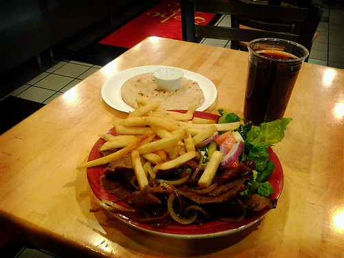
SoHo Cafe gyros are the best
These are things pulled in here or pushed to here from other sources.

This is what’s wrong with flickr, right now. You know things are bad when something that should be working 100% of the time doesn’t.
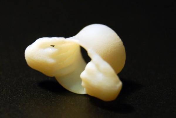
These actually made me go “aaarrggghhh” (via 3D printed Goatse ear-plugs – Boing Boing)
The most shocking revelation of the evening concerned cinnamon, which, in the United States, whether natural or artificial, is likely not to be cinnamon at all, scientifically speaking. “True” cinnamon flavour comes from the bark of the Cinnamomum verum tree, but the FDA has determined that the bark of the cassia tree, another member of the Cinnamomum genus, can also be sold as cinnamon.
So the Cinnamon Challenge has to be renamed to the Fake Cinnamon Challenge.
I wrote this review on the Android Market, but the service mangles all formatting so comments end up looking like crap.
I’m sorry to say that the interface changes implemented for 3.00 changed the app for the worse, just by removing two key pieces of functionality:
- “Go to top” option.
- “Pull to Tweet.”
Between those two, your actions will be that much slower. Gone is the ability to begin a tweet, pull up to review your timeline, then pull down again to finish it. Looking through old tweets and want to get back to the top? Too bad, you’ll have to flick through all those tweets in between.
Interface now has a “Home” screen, allowing access to search, favorites, trends, lists and “columns”, headers for which are always displayed. From here you may setup which columns you want to see on the interface, and in which order. Sadly, the “home” screen itself cannot be removed. In previous versions the “home” column was the timeline, but apparently users cannot figure that out. This all makes for additional wasted screen space.
This new version feels, all in all, made by developers who firmly believe their users are idiots who need to be hand-held to use the app. You are better off staying with the last version of Plume 2.x, at least until that basic functionality is re-implemented.
Emphasis mine.
It looks to me that in their rush to make the app compatible with Android 4.0, the developers threw aside some of the things that made their app unique. These things had been there since the first versions of the app, so it makes you wonder if the Google UI guidelines were written with an “all our users are idiots” mentality.
These changes to the app made a lot of the things that were understood implicitly about functionality to be displayed explicitly. Attempting a better User Interface made for a poorer User Experience.
When it comes down to it, another case of the UserFriendly Police beating down a good app.
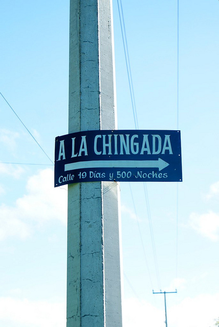
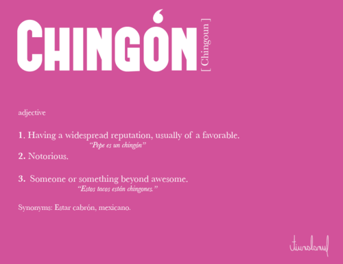
ya sabes por donde irle llegando…Si te mandan a la chingada en Cuernavaca, ya hasta la ruta pasa por ahi…
That children are now being conditioned to allow strangers to shove hands down their pants, that young women are subjected to genital inspections before being allowed to pursue their careers, that innocent people are adopting poses of humiliation and surrender in response to barked commands, is such a great harm to our society that no one with any sense of history could consider reducing the risk of an astronomically remote adverse event to be justification for TSA’s reprehensible actions. There’s just nothing to balance here. The harms are enormous, the benefits are make-believe. Disband the TSA, now.Nat Friedman - TSA debate